Project carried out while working at design agency Spintank in 2024. Web development by Matthieu Renaut.
Context
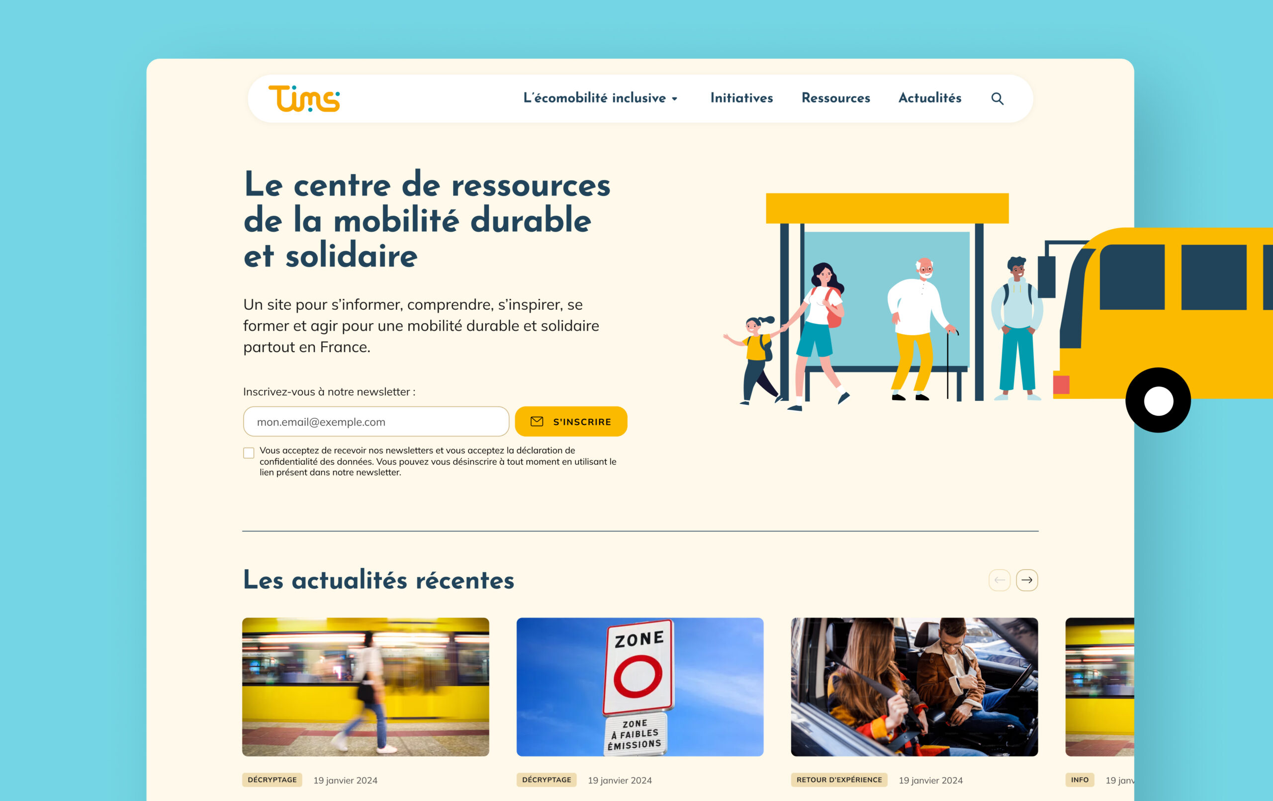
The Cler network, which brings together more than 300 organisations involved in environmental issues, needed to develop a tool to centralise all the local resources and initiatives on sustainable and inclusive mobility, covering the whole of France.
Solution
→ An accessible website and optimised guidelines for digital to reach as many citizens as possible
→ A modular, manageable solution, including an interactive map, so that the project administrators can build and manage the various pages of the site themselves
To adapt the existing print guidelines for digital use, I tweaked the colour palette to make it more contrasted and accessible, while maintaining the brand’s warm and human identity. I also reworked some of the brand illustrations to illustrate content more effectively.

The site’s administrators have a wide variety of components at their disposal, to carry static and dynamic content (which is intended to evolve over time, such as resources or news).
Content and news pages are made of interchangeable building blocks to enable the creation of a variety of visually coherent pages: text blocks, key figures, quotes, illustrations, images… not forgetting links to other pages on the site, or to resources and news.

The website lists all existing resources on sustainable and inclusive mobility in France, via dynamic content that can be managed. On an individual resource page, users can download the resource in question (publications in PDF format) or go to a dedicated website.

Users can easily discover local sustainable and inclusive mobility initiatives thanks to an interactive map, which can also be managed, directing them to relevant resources and suggesting they get in touch.

The website is responsive and optimised for mobile use: buttons are large and visible, the menu is always accessible via a sticky header and texts are readable.


I created a UI kit to facilitate web development and lay the foundations for a digital design system that the project’s administrators will be able to reuse in the future.