Project carried out while working at design agency Spintank in 2023, in collaboration with Lucie Bouana (UI), Eric Azara (UI) and Noé Falque (UX).
Context
To spotlight the ecological transition in France, Enedis, the operator of the electricity distribution network in France, has created the French Ecological Transition Observatory. This website provides users with data visualisations on key themes in the energy transition. As the initial version of the site had usability issues, they decided to redesign it, and used the opportunity to enrich it with local data.
Solution
→ An optimised sitemap for better navigation
→ The addition of local regional pages featuring a large number of indicators and explainers
→ The possibility to export and share indicators
→ The redesign of the homepage and main thematic sections
→ Optimised SEO thanks to the addition of individual indicator pages
I created an animated prototype during the tender phase to show the UI/UX concept of a regional page with interactive datavisualisations and explainers.
The first step was to analyse the existing site, with a UX audit. The datavisualisatons for instance didn’t have any visual consistency, and thematic content had no hierarchy. This first step lead to a sitemap redesign and to an overall improvement of the UI to improve usability and readabilty.

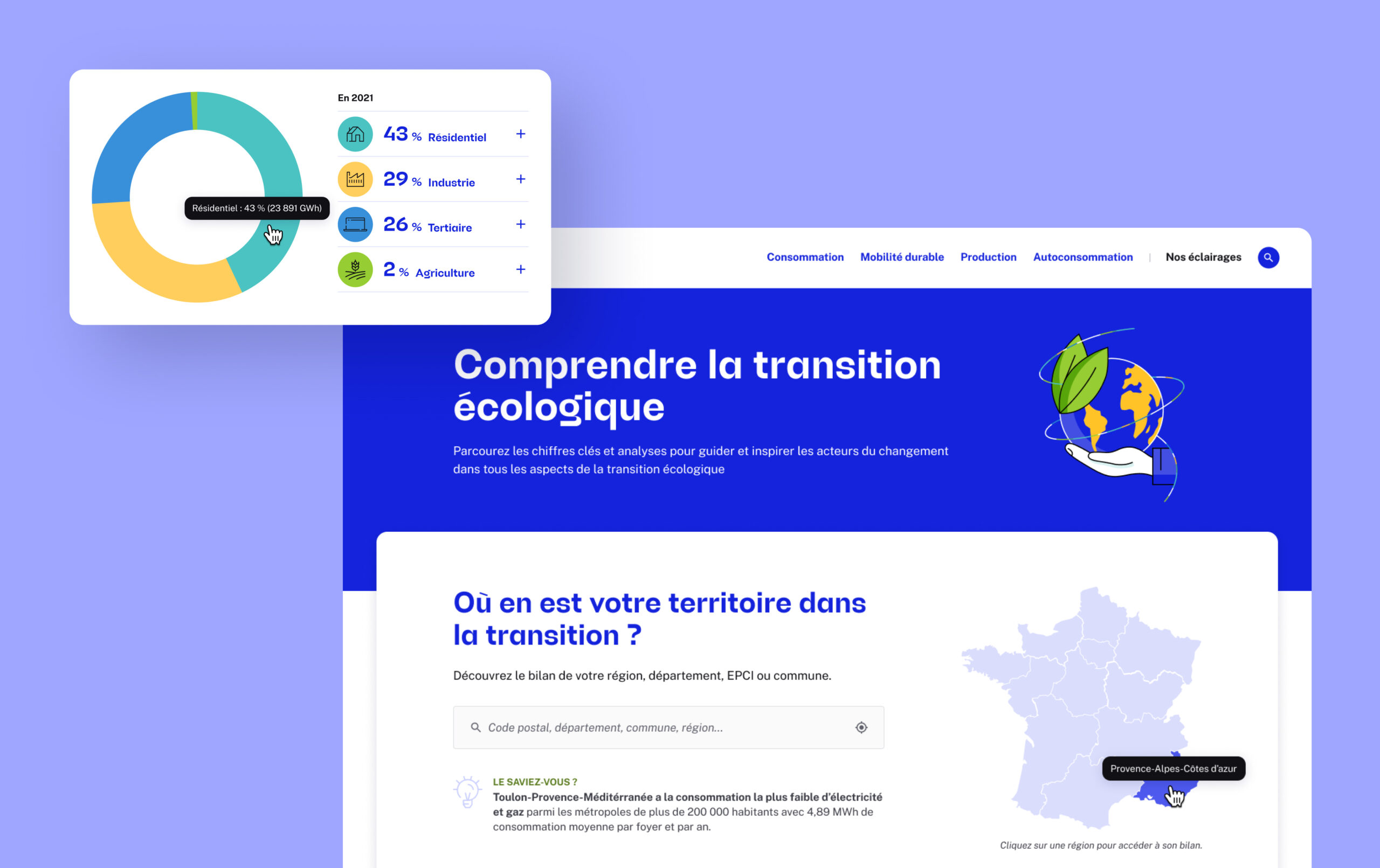
Searching a territory can be done on the homepage thanks to an interactive map directing users to regions, or via a search bar on the header, which is on all pages.

Each regional page (region, department, city…) showcases data from that territory organised within the four main themes defined by Enedis: electricity production and consumption, sustainable mobility and self-consumption.

To easily read or scan the page, I designed an in-page navigation always accessible in the left sidebar, with anchor links to sections within the page. It is also possible at all times to search for another territory.

Each dataviz is filterable and interactive. They give an overall view of the indicator’s current situation, its evolution in time and its comparison it with other territories. Tooltips give exact numbers on hover, and definitions when needed. Each dataviz can be exported and shared.


The thematic pages on the main energy-related issues present national-level indicators, background information and explanations. Those pages were an opportunity to bring some of the Enedis brand identity to the designs, using their illustrations.

Articles and search boxes are integrated into the pages, to encourage interaction and content discovery.

The Observatory website had to remain identifiable as part of the Enedis ecosystem, while still having its own look and feel. To achieve this, I used their own design system, which they remembered existed not long before launch.

In addition to the existing design system, I laid the foundations of a UI kit to keep a visual consistency within components and to help web development.